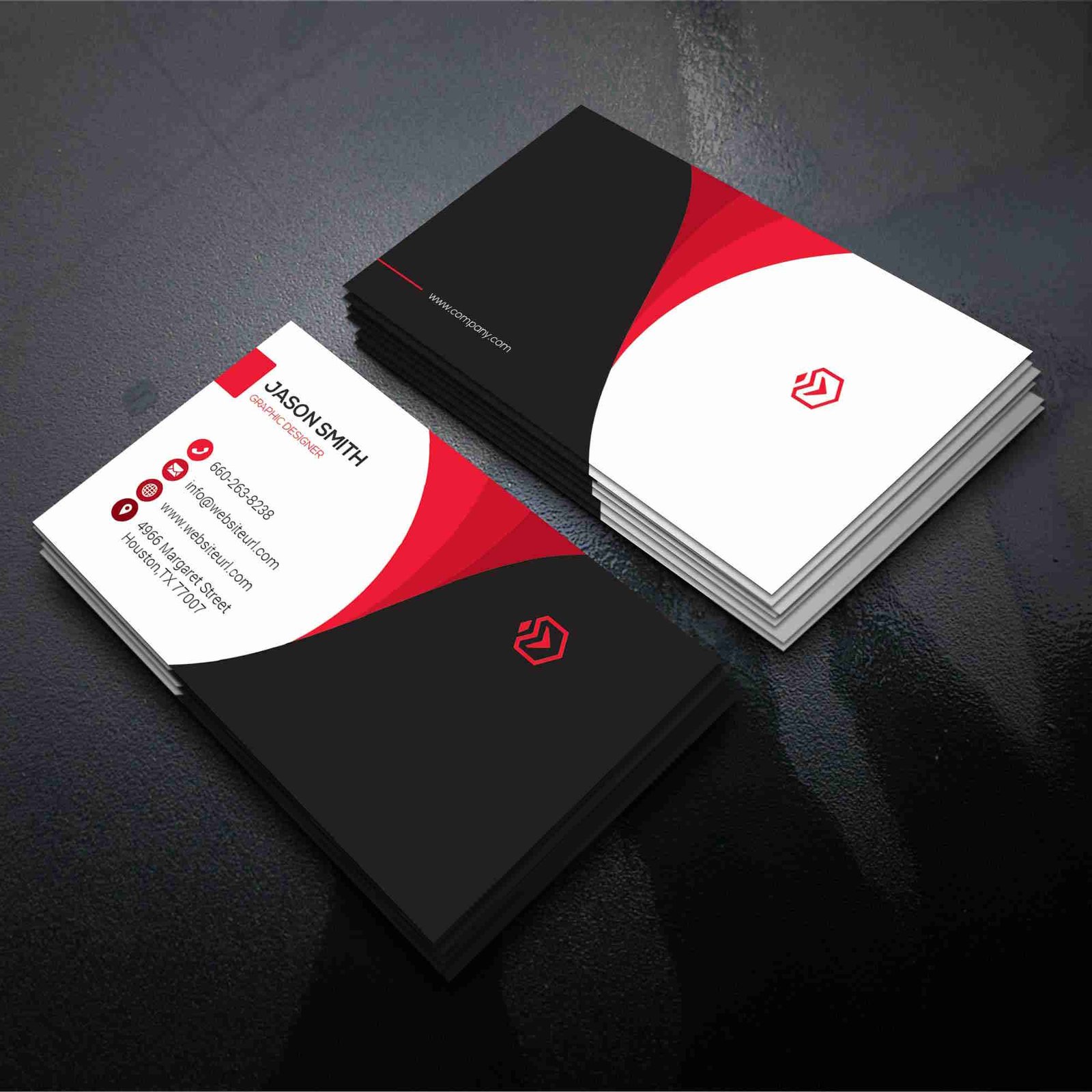
Whenever someone looks at your business card, they remember their first encounter with you. Then, if it works well, your potential clients will get in touch with you to learn more about what you have to offer.
The physical card acts as a reminder, but its design attracts the reader. The quality of visiting cards is a deciding factor for 72% of people, according to Research. There is almost no business owner who is without a business card.
There are a lot of interesting designs out there. The question is, which one is actually useful? Let’s discuss it!
Top Design ideas for business cards
The design of your business card greatly impacts the impression people have of you. Here are five ideas for business cards that will make an impact on business owners.
Make textures pop
Depending on the texture of the card, you have a variety of choices. And the texture design is the most obvious way to get recipients’ attention. A variety of textures are available, including eco-friendly options, velvets, laminations, cotton blends, and unique takes on standard cardboard boxes.
There are some selections that may require a higher price. It shows your clients that you’re serious about your work and willing to invest time and money. It is even possible to use plastic, a modern material that is highly durable. Just as every element of the visiting card should reflect you, your texture choice should do the same.
Imagination is the key, so let yours run wild and explore what seems exciting and appealing. You can play around with various textures, get feedback from others, and test them out to see what works. Within a short time, you’ll know what the best option is for you.
Bold colors are the way to go
According to some research, colored business cards tend to stay in the hands of potential customers for more than twice as long as monochrome cards. Visitors’ cards nowadays are full of color to give them that extra pop, making an impact on those who see them.
Further, it is a great way to convey your personality as well as the emotions you wish to bring about in others. Do you have a childcare center in your business? Make sure your color scheme is soft and pastel.
If it’s a gym over there, choose bright colors that will make people jump. Let your business’ colors speak for themselves as you consider what it represents. Focusing on yourself is also an option.
If you owned a business, what color would you represent for you? Do you have unique minimalistic ideas for business cards that fill your head with creativity? Make sure the cards contain a little purple because it represents the creative mind.
Don’t be afraid to add some yellow to your life if you’re joyous and full of life! It is possible to customize a brand’s color in infinite ways.
How about a little tip? Using gradients and metallic colors on business cards has become increasingly popular. If you’re searching for a wow factor, these unique options stand out.
Dual-sided design transition
It’s time to get rid of one-sided cards. In addition to your design’s ordinary and simple details, your brand has more to offer. Visitor cards with two sides have gained popularity over the past few years.
As a result, you can present yourself in a manner that is unique to you. A stunning, minimalistic approach on one side and a colorful twist on the other can work beautifully.
If you want to split information about your business, feel free to do so however makes sense to you. A lot depends on your style and how you understand your brand’s highlights.
You may want to use one entire side for your logo if it has enough strength for your audiences to notice it. Use your business name on one side and the rest on the other to emphasize it the most.
Use thermochromatic cards to experiment
You can alter thermochromatic prints or brighten them when touched. Such a business card raises intrigue, making it more likely for recipients to keep it for a long time.
You can include hidden messages and quotes if you want to showcase your brand’s personality. Ensure your card contains information you can access without touching it to prevent your peers from assuming it is a blank piece of paper.
Use QR codes in your design
The ease with which smartphones can read QR codes has made them increasingly popular. Users don’t have to manually type URLs when switching to the internet, which makes the transition easier.
If your card contains QR codes, it can remain in a digital format with the client forever. The QR code can also direct customers to your website, landing page, or product catalog. If you want, you can include as much information as you like on your card while keeping the design minimal.
You may have to wait for a page to load after scanning a QR code. Include crucial information on one side of your presentation to make life easier for your audience.


